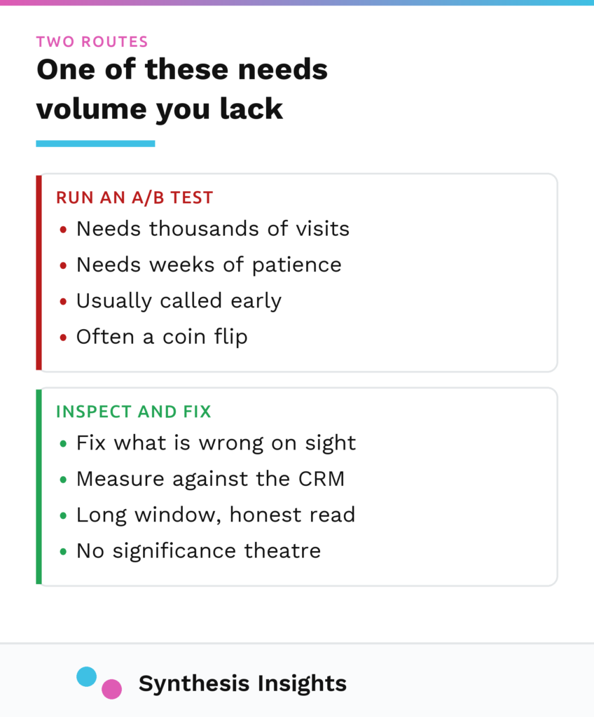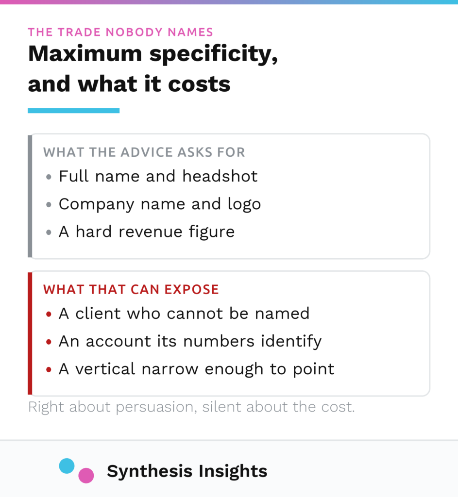
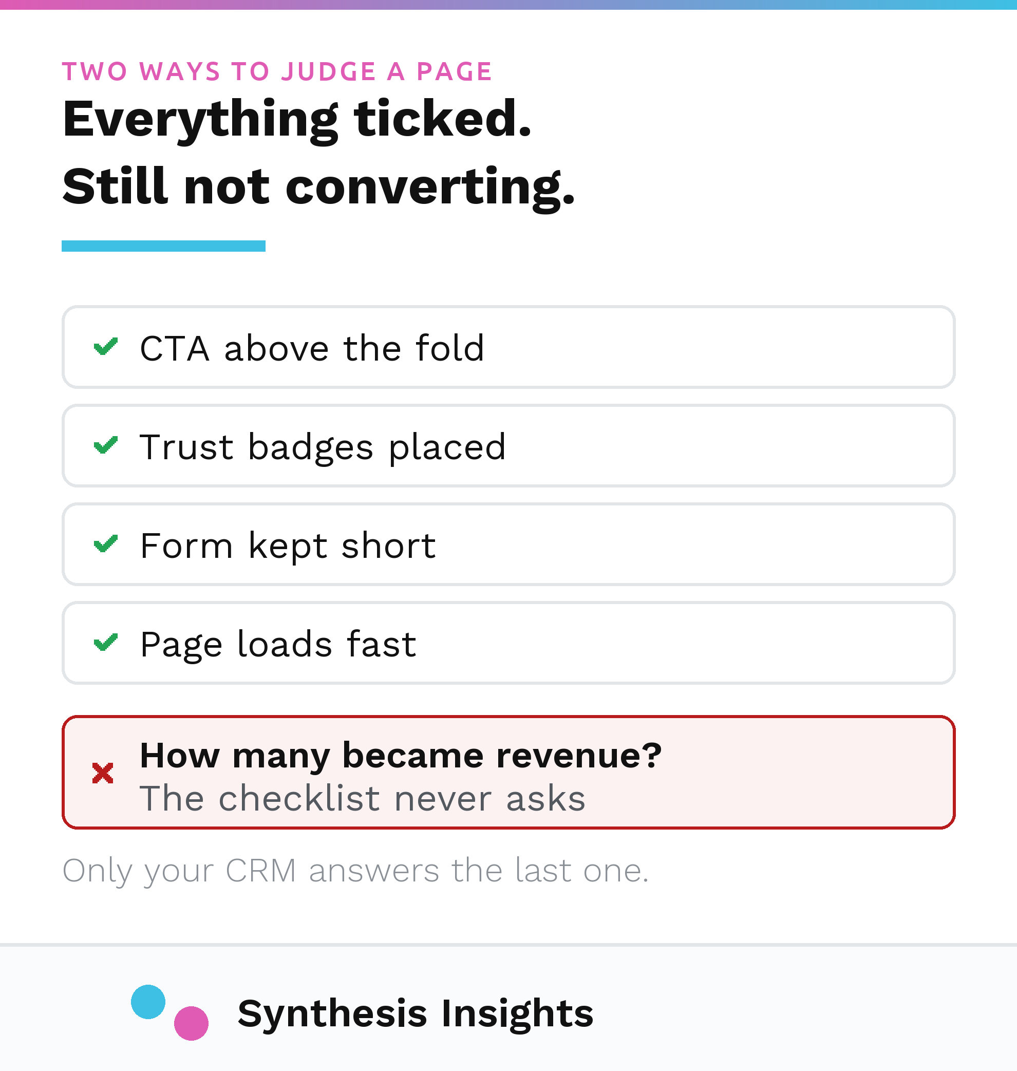
A landing page doesn’t get graded on how it looks. It gets graded on what shows up in the CRM a few weeks later, and those two verdicts disagree more often than anyone building a landing page wants to admit. You can build a page that hits every item on a landing page best practices checklist, title, subtitle, visual, social proof, a clean call to action, and still watch it take spend and produce nothing real. You can also ship a page that’s missing a section the checklist says you need and have it outperform the version that had everything.
The problem with the checklist is not that its items are wrong, it is that passing them settles nothing. The real test is the one question I run every element on a page against: would this help me sell if I met the customer in person? A stock photo of people shaking hands wouldn’t help me sell anything face to face, so it doesn’t belong on the page either. That question catches things a checklist can’t, because a checklist can only confirm that a section exists, which says nothing about whether it’s doing anything.
What I check first
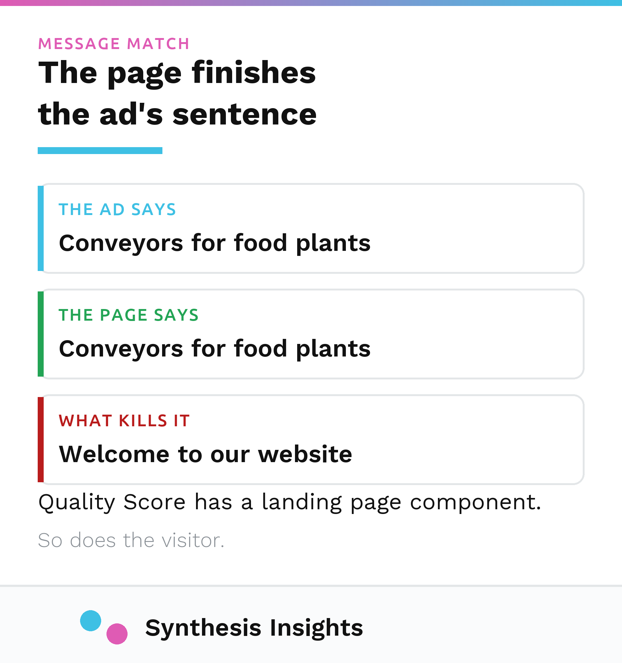
When a page is taking paid clicks and the conversions aren’t showing up, the first thing I look at is whether the page’s headline answers what the person actually typed, or what the ad they clicked said, and the design can wait. That’s message match, and it’s the single biggest reason a well-built page still fails: the visitor arrives expecting one thing and the page opens with something adjacent to it.
Google’s own Quality Score system is built around a version of this same check. Landing page experience, one of the three inputs Google uses to score a keyword, is defined around “the usefulness and relevance of information provided on the page, ease of navigation for the user, the number of links on the page, and the expectations users have based on the ad they clicked.” Google states plainly that “your landing page experience is one of several factors that helps determine a keyword’s Quality Score.” I don’t treat that score as the verdict, since Google computes it from its own signals and has no view of your CRM, but the underlying question it’s checking is the right one: does this page deliver on what got the click.
Mobile earns a second look every time, because it usually carries most of the traffic. A primary call to action that stays visible at every scroll depth, all the way down the page, is one of the more reliable levers I have for a page that gets clicked on a phone and abandoned before the form.
Two sections you cannot fake
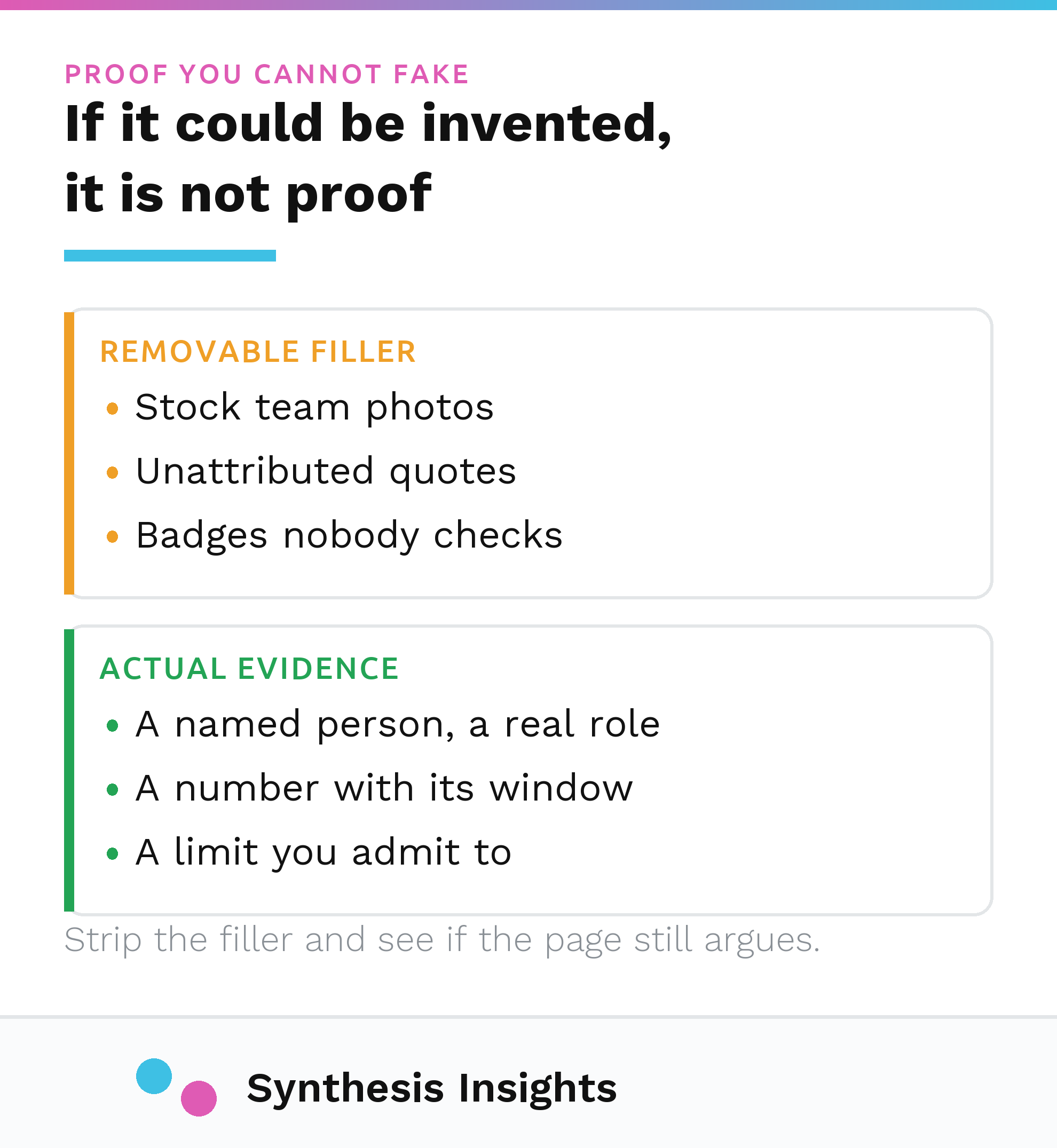
Social proof does two different jobs on a landing page, and both of them are the sections I refuse to invent. Above the fold, proof exists to make the promise believable: a number, a name, a real count, something that makes the claim above it credible on sight. Below the fold, proof exists to bring the offer to life, real people describing the actual result. Neither job can be done with placeholder text or a made-up testimonial, because the entire point of the section is that it’s true.
On a landing page I rebuilt, there were no testimonials ready at launch. Real ones simply didn’t exist yet. The honest move was to launch without the section and build it so it could drop in cleanly the moment real testimonials existed. The alternatives were delaying the page or filling the space with something invented to make the layout look complete. A section with nothing real in it is worse than no section at all, because a fabricated quote is one bad conversation away from becoming a credibility problem instead of a conversion lever.
The same discipline applies to anything the page states as fact rather than persuasion. On that same rebuild, an early draft said the team would respond within one to two business days, a reasonable-sounding guess nobody had actually checked. Once I asked the people who field the responses, the honest number was closer to a week. A landing page is an operational promise as much as a marketing one, and a response time, a capacity claim, or a turnaround the client hasn’t confirmed doesn’t belong on the page no matter how confident it sounds in the draft.
What the button actually measures
A call to action gets written as though clicking it is the outcome, when the thing you actually care about happens after the click. On a lead-gen page that hands the visitor off to a third-party form tool, your own analytics only ever see the click on the button. The completed submission, if there is one, lives inside the third-party tool’s own system. If nobody reconciles the two, the page’s dashboard and the CRM’s actual count of new contacts can disagree indefinitely, and the page will look like it’s working right up until someone checks.
That’s the same failure that shows up when a phone number on a page gets treated as a conversion the moment someone taps it, which is a click, not a call. I’ve written up that specific mismatch in full here, because it’s common enough on paid landing pages to deserve its own explanation.
The fix starts with wording the button honestly. Litmus, writing about email buttons rather than landing pages, puts the same principle plainly: “your button text should set the expectation for what your subscriber will encounter after they click.” The medium is different and the logic carries over anyway. A button that says “Get Started” on a page that actually hands the visitor to an external form is quietly overpromising, and the gap between what the button implied and what the CRM eventually records is exactly the gap a checklist never measures.
The same page I rebuilt had listed more services on it than the organization actually delivered directly, since a few of them were referred out. The page copy hadn’t been touched since the service list changed. A landing page promising something the client can’t actually deliver converts a visitor into a disappointed contact, which is a worse outcome for the CRM than not converting them at all.
One caution on speed, since every landing page listicle has a scary number attached to it. Google’s own page experience guidance says flatly that “there is no single signal”, and advises you not to “focus on only one or two aspects of page experience”. A slow page is worth fixing because it costs you people, and that reason holds whether or not a specific millisecond threshold flips a switch somewhere.
None of this is a case against the checklist. Title, subtitle, visual, proof, a clear call to action, they’re the right starting frame, and the b2b paid media work I run for clients starts every page audit there. But all the checklist can tell you is whether the parts exist, and whether any of it worked is a question only the CRM answers. If you’re running paid traffic to a page and can’t say with confidence which of those two answers you actually have, that’s the first thing worth a call.