So you have a great website and you’re spending advertising dollars, but you’re not getting leads or have a poor conversion rate…maybe your landing pages need some work. Don’t worry we’ve got you covered with our best practices for landing pages.
When creating your website, your landing pages can make or break the first impression that your customer has of your business. Ensuring that you design effective landing pages with your target audience in mind, will help you attract more users and convert more users into customers. User experience must be of utmost importance. As the very first point of contact users have with your website, your landing pages are the first opportunity to capture their attention and take them through your marketing funnel. So if you have a landing page that doesn’t impress, and a user leaves your site, that is a potential customer and a potential sale lost. However, it can be difficult to determine the best landing page design, what content you should and shouldn’t include, as well as what aspects are important to really focus on in a landing page.
What exactly is a landing page?
Landing pages are critical for any digital marketing strategy. A landing page is a designated web page that a user is directed to. Traffic can come from ads, an email link, or other referral sources. Landing pages can include your homepage, a blog page, a waitlist sign-up page, and more.
The more specific your landing page is for your audience, the better it will perform. Having been conversion rate optimization experts for nearly a decade, we recommend only one call to action on your landing pages. Typically landing pages aim to convert users into leads by prompting them to sign up for an email newsletter, gather contact information, or complete a sale. To get this information there generally must be some manner of incentive on your side of the exchange, and this can come in the form of a discount code, special offer, or information that the user finds valuable enough to give you their personal contact information.
Now onto our best practices for landing pages…
Landing Page Layout
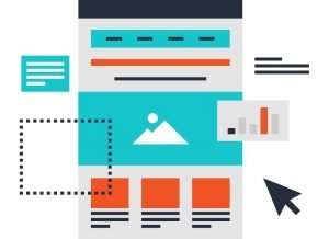
Layouts for landing pages often look much different from your normal website. Landing pages should only focus on one goal. What that goal is, depends on the purpose of your page. Is your page designed to capture lead information? Or is it trying to capture emails? Or are you simply trying to get them to another page on your website? It’s important to determine the goal of your page.
When you’ve determined your goal, this means only focusing on getting users to complete this one task. In our experience, we remove all menu bars and any links to parts of our website that are unrelated to our primary goal. Remember, you only have one chance to get a user to complete an action and you spend a lot of effort getting them there.
Next, we’ll cover the two big sections of your landing page. The area above the fold and the area below the fold.
Above the Fold
“Above the fold” refers to the placement of information or content on your landing page, content that is above the fold is what the user will see as soon as they enter that page. This means that this content is significantly more likely to be seen by the user and attract their attention. What you choose to place above the fold should be relevant and interesting information that gives a call to action to your audience and in turn, gets them to interact and spend more time on your website. Choose enticing images or video demonstrations to captivate, educate, persuade.
- Explain the value you provide (title)
- Explain how you’ll create it (subtitle)
- Let the user visualize it (visual)
- Make it believable (social proof)
- Make taking the next step easy (CTA)
Titles – Expalin the value you provide
The very first thing that most users will see will be your landing page headline, so it is important to describe what is the benefit to them in an accurate and captivating manner. As with most copy, you want it to be compelling and informative, but you also want it to stand out and really grab the attention of the reader. Your title gives the user a little taste of what’s to come in the rest of your content, so don’t be afraid to pull out the big guns and get creative with your titles and subtitles.
Subtitles – How you’ll create value
Subtitles are where you get more specific. Here you’ll introduce the product or service and how it creates the value you stated in your title.
Display the product or image in action
By displaying your product or service in action, either in the form of a photo or video demonstration, you are much more likely to gain conversions by displaying the benefits of your product and its usefulness. Clearly displaying what you have to offer is the best way to capture genuine interest from users and convert them into paying customers. Still, images can be effective and get the job done, but if possible videos can offer an even more impactful impression.

Use testimonials and social proof
Using authentic testimonials from past customers or clients carries a lot of weight in gaining a person’s trust. You can use reviews from popular sites like Yelp or Google to add more appeal and grab the attention of users.
An alternative to this would be adding a built-in review system, where customers can leave a review for your product or service directly on your website. You can then create a carousel of these reviews on your landing page so that users who arrive on your landing page can see a rotation of positive reviews about your product or service.
Adding social proof will show users that people love your business and have had positive experiences, adding live sale notifications is also a great way to display to users currently on the site that there is urgency for your products and that they are selling in real-time.
CTA
CTA, known as Call to Action or Click to Action, is essentially a message that prompts the user to take action, whether it’s a free trial or discount offer, or a newsletter sign-up, something to get the user to provide contact information or browse deeper into your website.
Your CTA is a very integral part of both your website and landing page because it is what prompts the user to do what you want them to, which is to give you their information so that you can contact them in the future.
Another benefit of CTA’s is that offering something such as a discount or exclusive content, will encourage visitors to spend even more time on your website. For example, let’s say you have a CTA that offers them a discount on their order if they sign up with their email and phone number, once they do so and receive the discount code they are likely going to spend more time browsing your site looking for products they may be interes†ed in.
Below the Fold
“Below the Fold” is the counterpart of an earlier term “Above the Fold”. Essentially anything below the fold is content that the user will need to scroll down to see, this means that when they land on your website’s landing page they won’t make contact with it until they decide to scroll down the page. For this reason, it’s important for the content above the fold to really grasp their attention and give them a reason to continue scrolling. Just because what they see above the fold is crucial as it is the first impression they have, what is below the fold is equally as important to hold their attention and keep them scrolling. So make sure you keep the tone of voice consistent and the quality of the content the same throughout the landing page and your entire website.
- Make the value concrete (features and objections)
- Bring to life your offer (social proof)
- Tie up loose ends (FAQ)
- Repeat your call to action (2nd CTA)
- Make yourself memorable (Founder’s note)
Features and Objections
In this section, you’ll first want to make good on all the promises that you made above the fold. This is more in-depth on how your product or service delivers what you say it does.
Secondly, you’ll want to handle all of your customer’s biggest objections upfront. Take the time to survey your customers and use their words about how you were able to handle their objections.
More social proof
One of the most compelling ways to sell your product or service to someone is by showing that it has been well received by others and they were satisfied with their experience. As social beings, humans want to know that others had a positive experience and saw value in the product or service that they received. So why not include even more social proof, make sure to include as many details as you can to build credibility, providing names and location under reviews and live sales is a great way to do so.

FAQ
FAQ, or Frequently Asked Questions, are something very beneficial to include on a landing page because there is a great chance that a user coming to your website will have some questions they want to be answered. Or they might want to know more basic information about your company, or your products and services.
Another CTA
We know…we already said to have a CTA but it’s always a good idea to have several calls to action throughout your website. Have a newsletter pop up when a user arrives on the site, have exclusive content or discounts available if they take a certain action such as enter their email, sign up for an account, etc. This gives you a better chance of getting their contact information, if you didn’t get it with the first CTA maybe the second one will be more compelling or they have seen more of your content which and likes what they saw.
Founders note about your WHY. Why did you create this product or service
Something that is often left out of many landing pages is a note from the founder or a brief ‘about’ segment. Having a quote from the founder about the ‘why’ of the business or some insight into who they are can go a long way in creating a personal connection with visitors. More and more, people want a peek into the behind-the-scenes of the brands that they are purchasing from. They want to know what sets you apart, hearing from the founder is the perfect way to feel more connected and to build trust with users by humanizing your business.
Bonus: Length of Landing Page
We get asked, “how long should my landing pages be?”, all the time. And it’s a great question, that we usually answer with… “it depends”.
Case For Short Landing Pages
One thing is certain… attention spans are short, so why not keep your landing page concise. In many cases, we see short landing pages vastly outperform long complicated ones. If you’re asking for something small, like an email for a free e-book or selling an inexpensive product, then you may be better off just getting right into your ask. If these landing pages are directly strictly from ads or email links, a short landing page may be the way to go also.
Case For Long Landing Pages
If you’re going to be using your landing pages for a big ask, then a longer landing page is typically a stronger performer. It will give you more time to value justify your product or service. Longer landing pages also vastly outrank shorter landing pages for SEO.
With landing pages, we love experimenting and testing to see which pages perform best. In the end that is the best way to see what will perform best for you.
Things to Look for On Your Landing Pages
Mobile Friendliness
Mobile screens are more prevalent than ever. If you have web traffic coming from phones or tablets (and you probably do), then the mobile user must be an important buyer persona. Testing your mobile landing page and different devices and OS is critical. Make sure that CTA buttons and your mobile form are clear and functional.
Top Exit Pages
Knowing your website’s top exit pages is another way to better understand the user journey. For instance, if one of your top exit pages is also a landing page then you’ve got a problem. Ideally, you want to keep visitors on your website for as long as you can and you want them to visit several pages along the way. This is why having engaging and eye-catching content on all landing pages is absolutely essential.
Technical Issues and Page Speed
With all pages of your website, but especially your landing pages, you want to make sure that load times are quick and that there are no technical issues that would cause users to leave. One of the worst things that happen when visiting a website is running into technical difficulties, maybe a link doesn’t function properly or an image won’t load. A one-second delay in page load means 7% fewer conversions and 11% fewer page visits. It makes the experience less than ideal for visitors and will leave an ill impression of your brand, making them unlikely to come back.
Testing
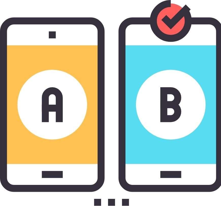
A practice that may seem rather obvious but can often be overlooked, doing A/B testing on your landing page(s) is one of the best ways to be confident that you are making as many conversions as you possibly can. Test your CTA and your copy, and then test them again to see what resonates most with users visiting your website. It’s okay and even encouraging, to go through several versions to see which drives more conversions. Try different layouts, with various color schemes to see what is more captivating for your audience.
A good landing page builder will have testing built-in. A great free tool for testing is Google Optimize. Google optimize lets you test different elements or different landing pages against each other to find a data-driven winner.
Page Visits
The number of page visits to your landing page is something very important to note because it gives you an idea of how well your SEO and advertising efforts are doing. Most likely, you’ll be able to filter your page visits by date which can give you an idea of whether your landing page is attracting more visitors on certain days, weekends for example, or if you have a specific landing page during a holiday.
Traffic Source
Knowing the source of visitors to your landing page, whether it be a social media post, paid ads, an email campaign, etc., can help you identify which of your efforts are resulting in more page visits. If you find that a specific paid ad performed really well and brought a lot of traffic to your landing page, you know to further invest your time and money into that mode of advertising. It’s also worth paying attention to the bounce rate as well as average time spent on your landing page to get an even better look into how effective your landing page is at retaining the traffic.
Conversions
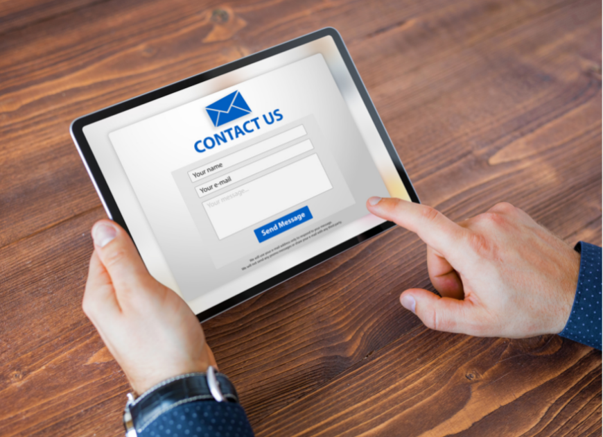
Conversions can tell you a lot about your landing page, depending on the primary objective. If your goal is to prompt users to sign up for your email list, conversions can tell you how effective your landing page is at convincing visitors to enter their contact information and subscribe to your newsletter.
This can also give you insight into why they are on your website, for instance, if you notice a majority of people make their way to your landing page through a paid ad where they are prompted to sign up for a waitlist for a product that is currently out of stock but will soon be available for preorder, then you know exactly why they are there. If you notice that your landing pages bounce rate is fairly high then that tells you that while the paid ad did its job, maybe there is a better way to optimize your landing page to offer other product suggestions or navigate their attention elsewhere on your website.
Bounce Rate
The bounce rate of your landing page is basically the rate at which users “bounce” off of your website, meaning they arrive on your landing page and then exit your site without visiting another page. Your bounce rate can tell you a lot about whether or not it is effectively capturing the attention of users, and then keeping them interested. If your bounce rate is high that means your website visitors aren’t interested enough to stay very long.
Benchmarks
Benchmarks are a great way to create a baseline of where you are currently and where you want your landing page to be performing. Essentially benchmarks are a point of reference to help you base your goals on. For instance let’s say the average website has a 2.5% conversion rate and your current conversion rate is at 1.5%, this gives you a good benchmark to aim for, and when you reach 2.5% look at the next benchmark so that you can aim even higher to continuously improve your landing pages and reach more users and make more conversions.
We know that if you follow these best practices for landing pages, you’ll see your conversions skyrocket. A great landing page can really boost activity on your site and even create long-lasting relationships with consumers. Your aim should be to guide target customers through your site by strategically placing imagery and copy that persuades them to take action. Creating a high-converting landing page can take a lot of time and testing to figure out what works, but once you optimize your content to follow these landing page best practices you should see significant improvement.

